
brighten
the corners
portfolio
visual
identities
corporate
design
:helen hamlyn
research centre
![]()
![]()
:letterhead
:compliment
slip / business card
:various broschures :news
magazine :poster
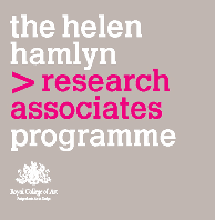
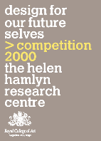
‘the helen hamlyn research centre’
corporate identity reflecting the nature of the centre which
deals with elderly people’s needs in today’s society.
reacting to several complaints about the previous identity’s
illegibility, this design was given a characteristically
clean look with large and legible typefaces.
this approach was applied to all the centre’s printed matter
such as leaflets, programmes etc.
client
the helen hamlyn research centre, london
brighten the corners
concept and design