brighten
the corners
portfolio
kommunikationsdesign
forschung
a
one year research project on packaging at the
helen
hamlyn research centre at the
royal college of art, london.
An introduction
text to the research project by Jeremy Myerson,
Director of the Helen Hamlyn Research Centre:
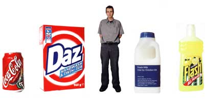
"Supermarket
packaging is all around us. During an average
visit to a store, we will see 30,000 products within 30 minutes.
The packs themselves contain more legally-required information
in the ‘small print’ than ever before – not just list of ingredients,
name of manufacturer, place of origin, net weight, nutritional
values and instruction for use but also cautions on the environment,
GM content and allergies. For older consumers, mandatory
information of this kind is especially important in the context of
maintaining a balanced diet or taking medication. Yet back-of-pack
‘small print’ is often an afterthought, given less design attention
than front-of-pack brand imagery, and reproduced in sizes, formats
and concealed locations that make life very difficult for an ageing
population with deteriorating eyesight.
This report (see.pdf above) describes the background thinking,
process and outcomes of a one-year design research project
which set out to communicate the needs of older users to the UK
packaging design industry. A key approach was to isolate existing
‘small print’ solutions from their context, highlight their deficiencies
and test alternative approaches with a user group of 16 older
consumers drawn from the University of the Third Age.
The study looked at typography as ’the packaging of information’
and analysed good practice in terms of size, fonts, leading, spacing,
alignment, contrast, icons, tables, printing materials and technology.
But it concluded that the whole issue is much more complex than
simply adhering to new guidelines on legibility. As part of the study,
Milk and Paracetamol supermarket packs were redesigned to improve
reading and accessibility of information. The results of tests with the
user groups revealed that only an alignment of information design
with brand strategy would win consumer trust – there was a point
at which honestly conveyed information became unappealing.
A key message to emerge from the project is that improving visual
information for older people entails engaging in a moral argument about
degrees of honesty and persuasion in pack design. The central conflict
between advertising imagery and ‘truthful’ information in how we ‘read’
packs must be addressed.
Within the context of the Helen Hamlyn Research Associates Programme,
the project has looked closely at a key design challenge facing an ageing
population. It has not simply skated across the design surface but
explored more profound issues about how we consume images that will
have growing impact in an age of internet shopping – an area touched
on by the study.
For the external research partner – the PSAG – the project has grasped
an issue that few brand managers or packaging design agencies have
as yet really come to terms with despite the mounting demographic evidence
before them. PSAG can now rightly claim some authority in this area.
A key outcome of the project is a recommendation to produce
a pocket-sized compendium of ‘small print’ examplars and useful information
about labelling to go on every art director’s shelf next to the Pantone
book.
We hope that this publication can be achieved as there is a clear
need for it."
Jeremy Myerson (Director, Helen Hamlyn Research Centre, Royal
College of Ar, 2000)
helen
hamlyn research centre
full
packaging report (.pdf file / 130 pages / 5.5MB)
get
acrobat reader to read .pdf